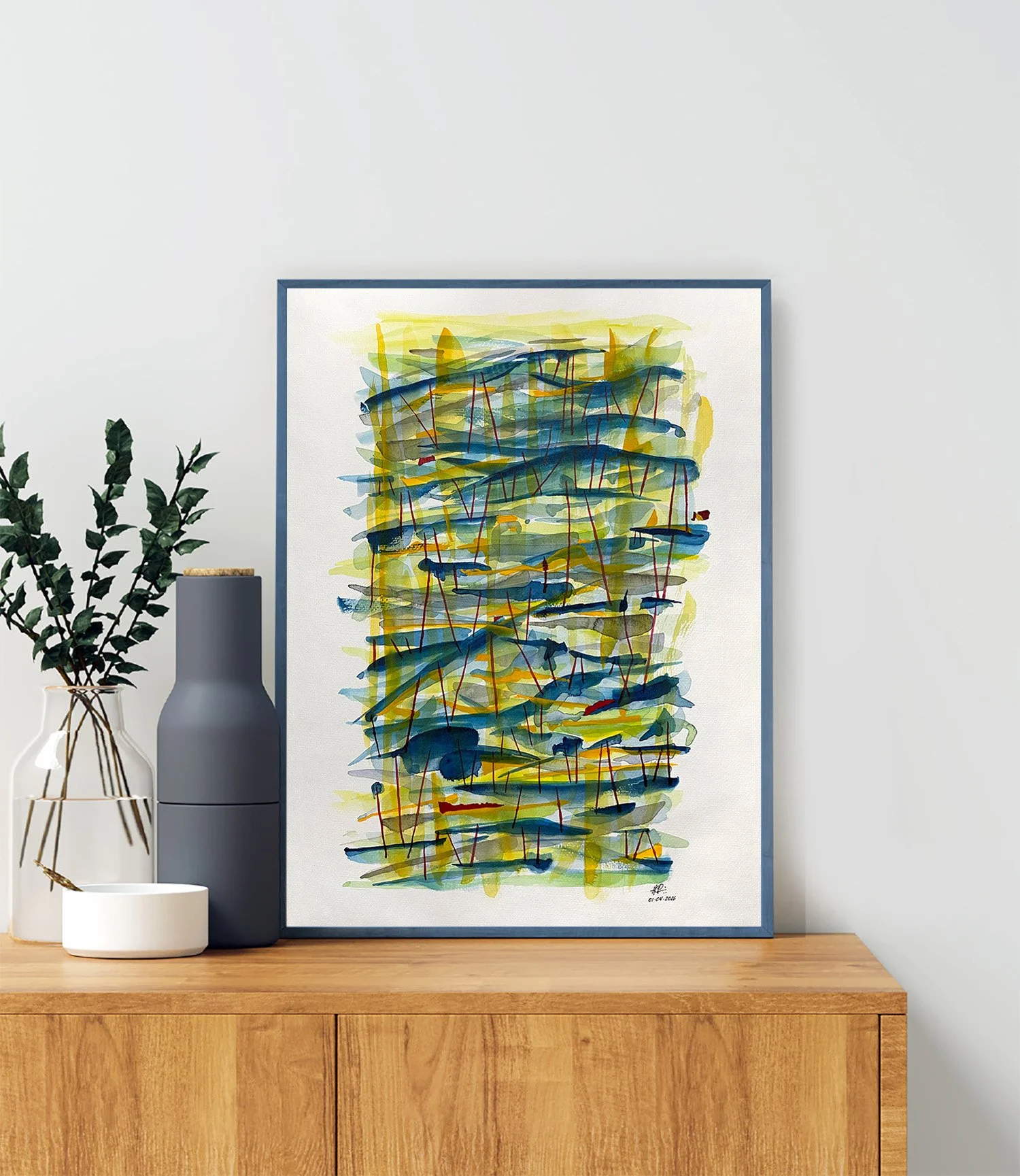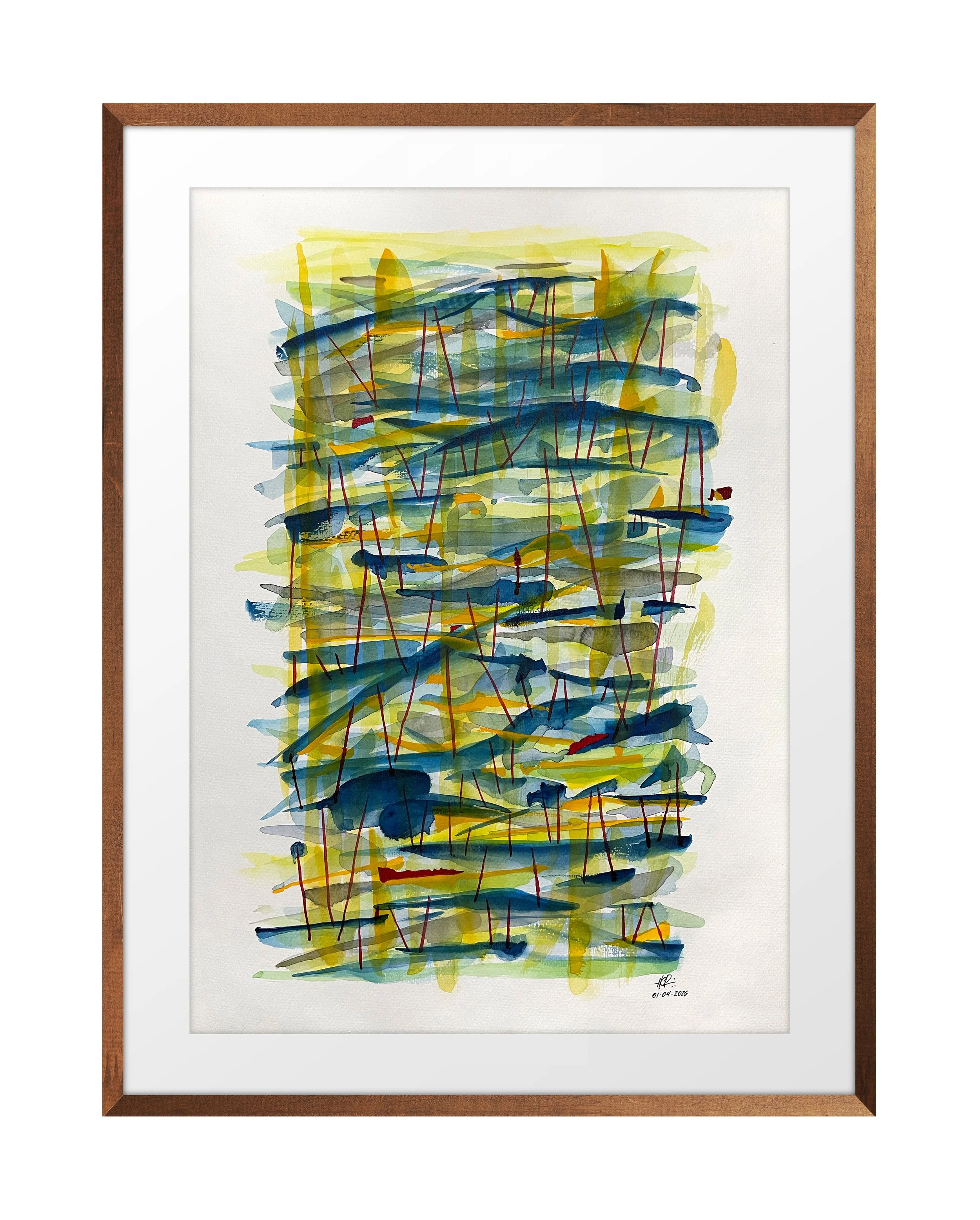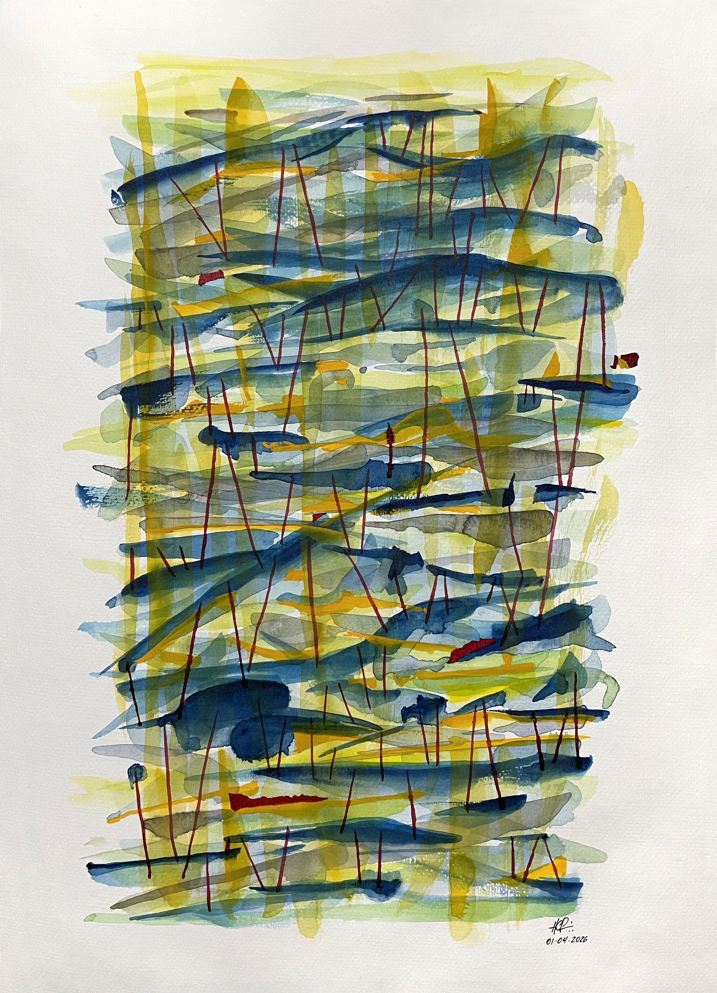
Abstração 39 - Rhythms beneath the surface, the forest

US$ 360,00

30 × 42 cm - Paper hahnemühle

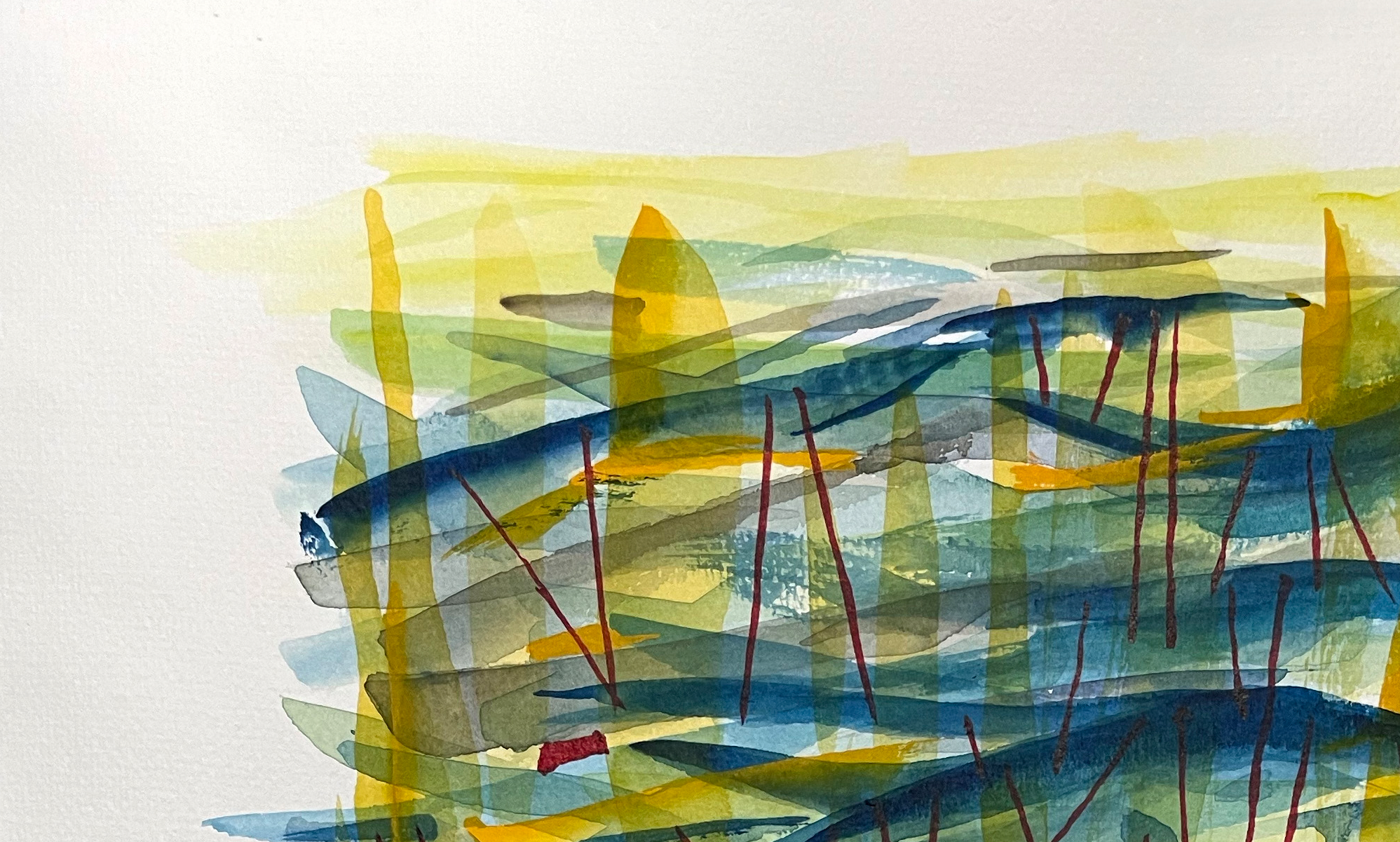
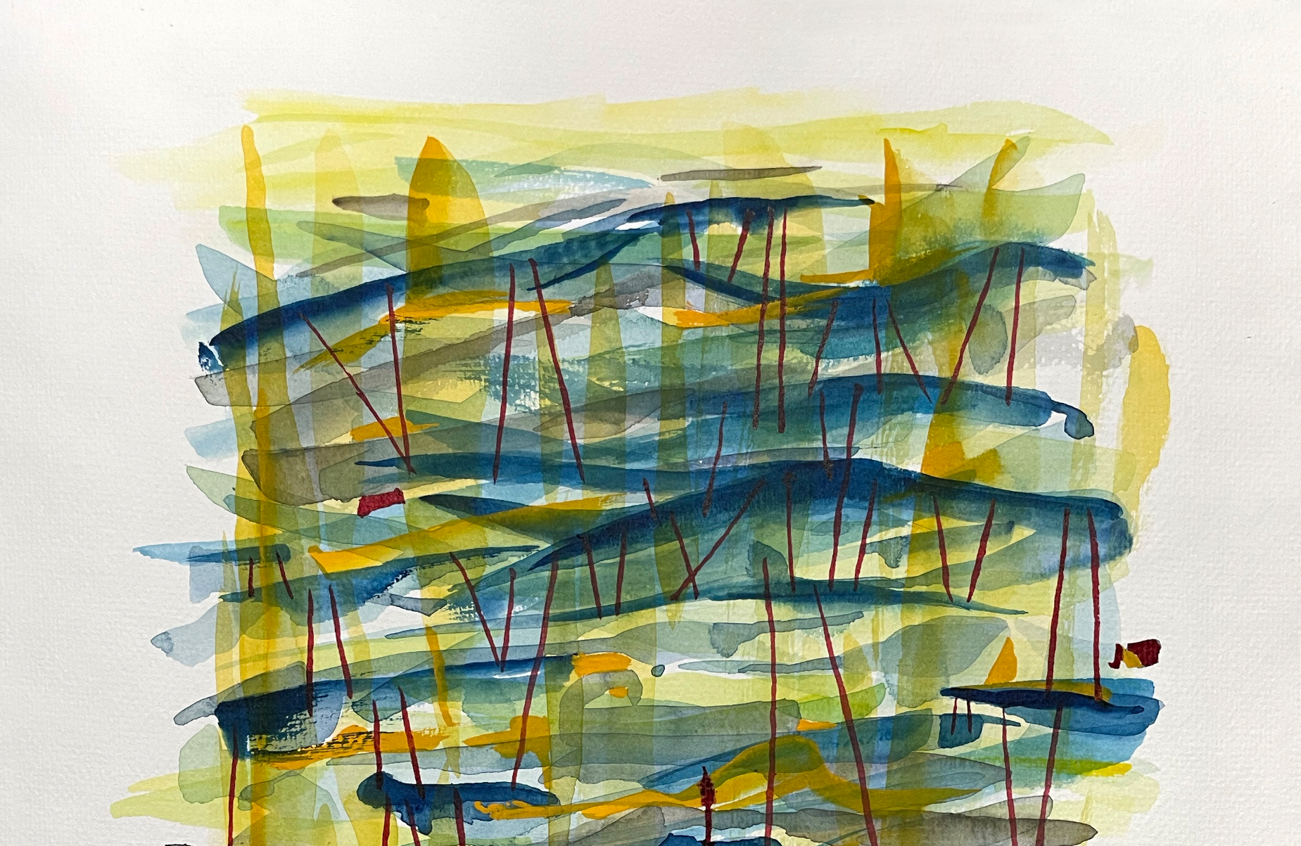
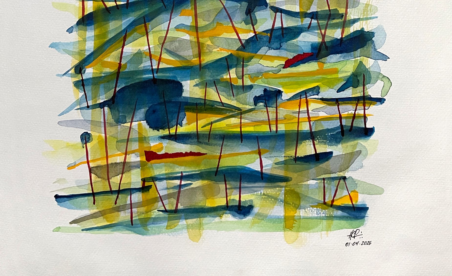
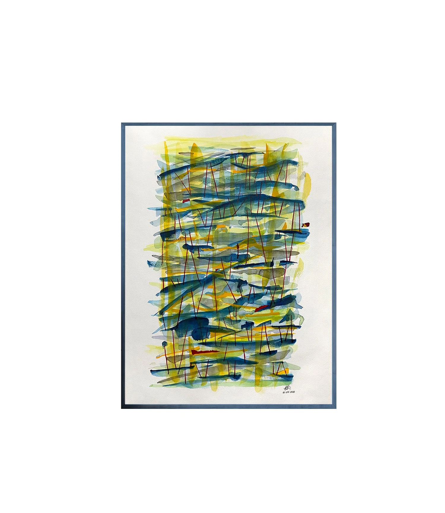
This watercolor moves away from literal landscape and enters a more intuitive, expressive territory. Built through layered washes of blue, green, and yellow, the composition unfolds as a field of shifting forms, where horizontal flows and vertical accents create a sense of rhythm and movement.

The blue gestures suggest currents or drifting elements, while the vertical red lines introduce tension and structure, evoking traces of vegetation, reflections, or hidden frameworks within the landscape. Rather than defining a specific place, the painting captures the sensation of observing nature in motion—where water, light, and form continuously transform.

Transparency and overlapping layers allow the colors to interact freely, revealing depth without relying on traditional perspective. The composition feels both organic and constructed, balancing spontaneity with a subtle internal order.

This work continues an exploration of abstracted landscapes, where gesture, color, and rhythm replace.

30 × 42 cm - Paper hahnemühle

This watercolor moves away from literal landscape and enters a more intuitive, expressive territory. Built through layered washes of blue, green, and yellow, the composition unfolds as a field of shifting forms, where horizontal flows and vertical accents create a sense of rhythm and movement.

The blue gestures suggest currents or drifting elements, while the vertical red lines introduce tension and structure, evoking traces of vegetation, reflections, or hidden frameworks within the landscape. Rather than defining a specific place, the painting captures the sensation of observing nature in motion—where water, light, and form continuously transform.

Transparency and overlapping layers allow the colors to interact freely, revealing depth without relying on traditional perspective. The composition feels both organic and constructed, balancing spontaneity with a subtle internal order.

This work continues an exploration of abstracted landscapes, where gesture, color, and rhythm replace.

A impressão Fine Art é a escolha ideal para quem busca qualidade superior e durabilidade nas reproduções artísticas. Utilizando papéis especiais de alta gramatura e tintas de pigmento, essa técnica proporciona cores vibrantes, detalhes precisos e resistência ao desbotamento.

Opções de impressão Fine Art em diversos formatos:

  • Pequenos formatos (A5, A4, 20x30 cm): perfeitos para portfolios, edições limitadas e obras que valorizam detalhes minuciosos.

  • Médios formatos (30x45 cm, 40x60 cm): ideais para exposições e decorações residenciais, equilibrando impacto visual e praticidade.

  • Grandes formatos (60x90 cm, 80x120 cm e maiores): recomendados para galerias, espaços corporativos e instalações que necessitam de presença marcante.

  • Formatos personalizados: impressão sob medida para projetos especiais, como livros de arte, álbuns fotográficos e painéis decorativos.

Além do tamanho, a Fine Art também oferece opções de acabamento que valorizam ainda mais a obra:

  • Papéis acetinados, foscos ou texturizados, como algodão ou algodão com textura de aquarela.

  • Opção de impressão em canvas Fine Art para efeitos tridimensionais e toque diferenciado.

  • Possibilidade de laminação incolor para proteção adicional contra poeira e umidade.

Investir em impressão Fine Art em diversos formatos é garantir que sua arte seja destacada com excelência técnica e estética, independente da finalidade ou local de exposição.